Create and edit a certificate template
To create a certificate for our courses, follow these steps:
Creating the certificate
-
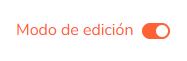
Go to "My courses" from Campus on the home page.
-
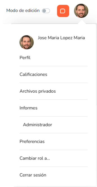
Click the user icon in the top right corner and select "Administrator".
-
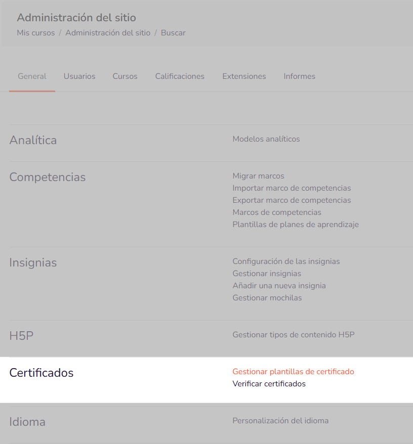
On this screen, locate the Certificates section and click "Manage certificate templates".
-
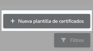
Here you can add a new certificate template to use across various courses by clicking "New certificate template".
-
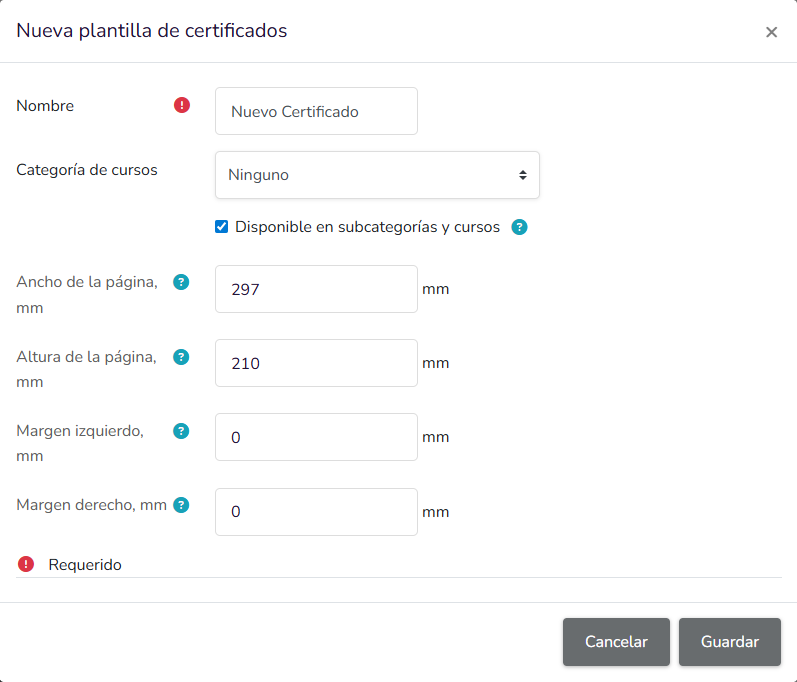
A window will open where you can set the certificate name, assign it to a specific course category, and specify its dimensions.
-
Fill in the certificate name, click "Save" and proceed to the next screen.
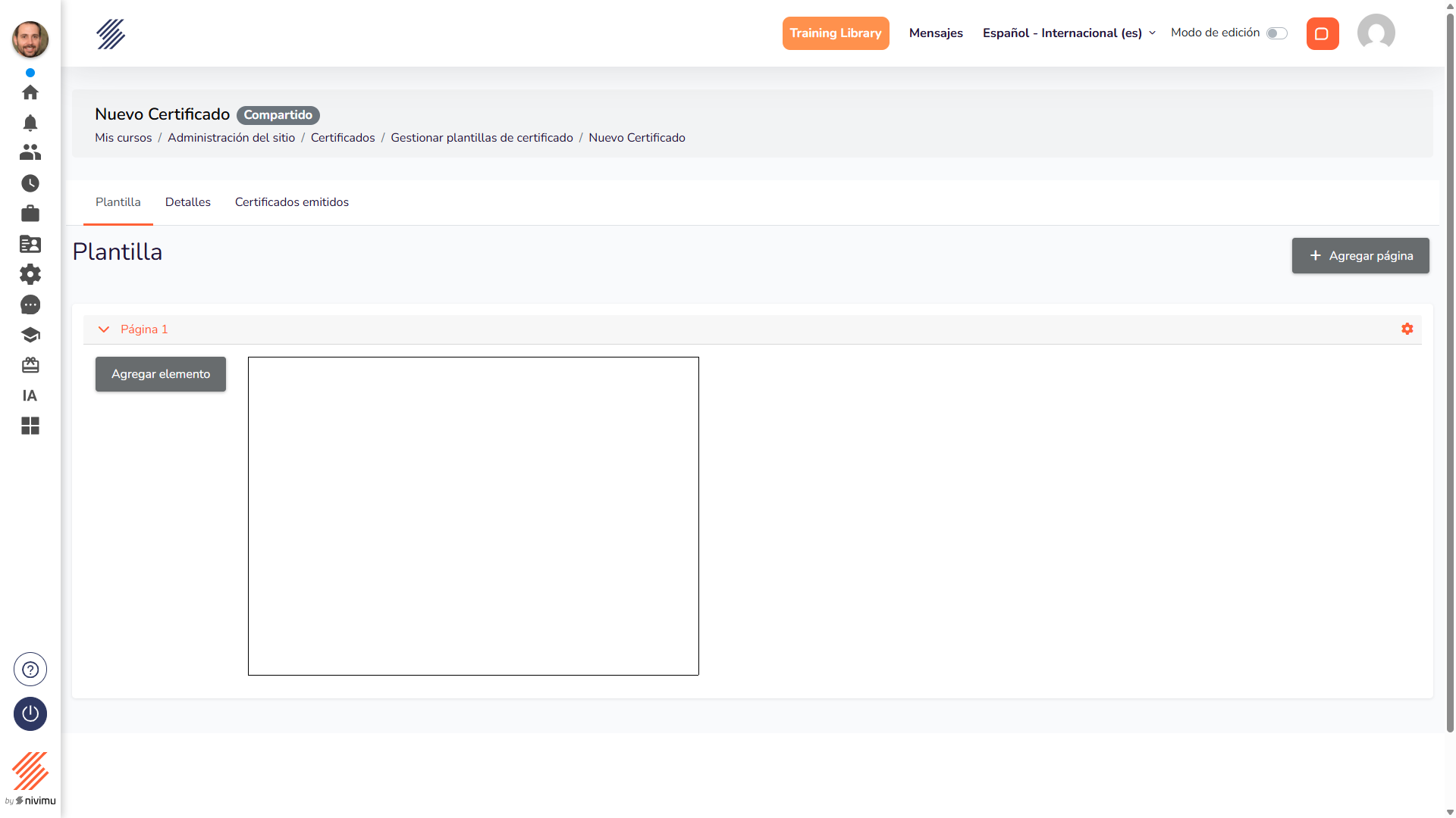
The screen shown above is where you can format your certificate using the various elements available, which are described below.
Editing the certificate
On this screen you will find several elements to edit your certificate:
Add page
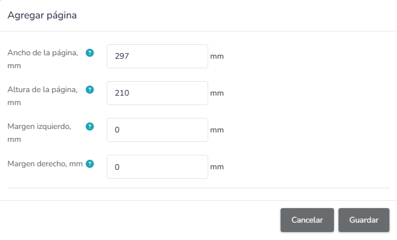
To add a page to the certificate. Enter the desired canvas and margin dimensions and click "Save".
Edit page
To edit the dimensions of each page.

Add element
Dropdown menu with the following options:
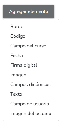
1. Border
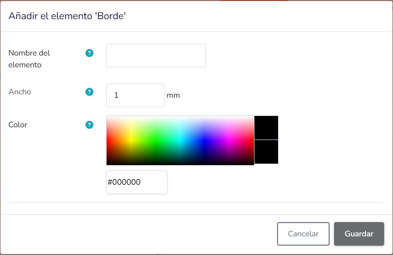
- Element name: Free text field to assign an identifying name to the element.
- Border: This name is used to distinguish the element within the template.
- Width: Numeric field defining the border width. The value is entered in millimetres (mm). Default value: 1 mm.
- Color: Color selector to define the border color.
- A graphical color picker.
- A field to enter the value in hexadecimal format.
2. Code
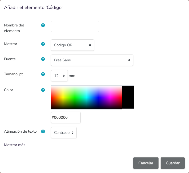
- Element name: Free text field to assign an identifying name to the Code element. This name is used to distinguish the element within the template.
- Show: Dropdown to select the code representation type. The value shown in the screenshot is QR Code.
- Font: Dropdown to select the font associated with the element. The value shown is Free Sans.
- Size, pt: Numeric field defining the element size. Default value: 12, unit: mm.
- Color: Color selector for the Code element.
- A graphical color picker.
- A field to enter the value in hexadecimal format.
- Text alignment: Dropdown to set the alignment of the element content.
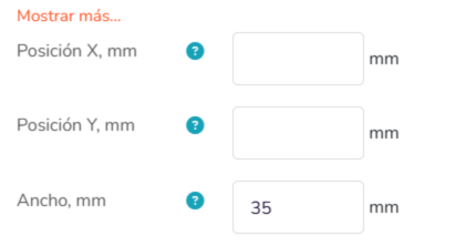
- Show more…: Clicking this button opens a panel to position the code within the design.
3. Course field
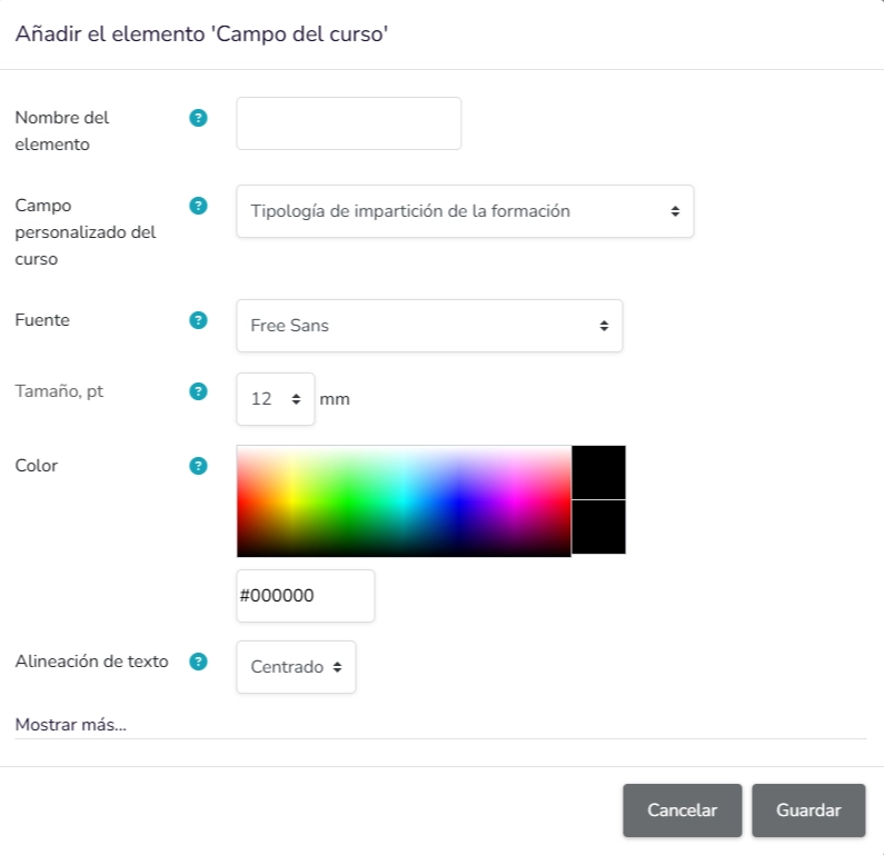
- Element name: Free text field to assign an identifying name to the Course field element. This name is used to distinguish the element within the template.
- Custom course field: Dropdown to select which course field will be displayed on the certificate.
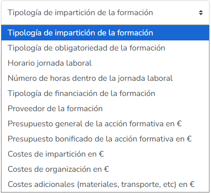
Available options:
-
Training delivery type: Displays the type under which the training is delivered.
-
Training mandatory type: Displays whether the training is mandatory or not.
-
Working hours schedule: Displays the working hours schedule associated with the training.
-
Number of hours within working hours: Displays the number of training hours completed within working hours.
-
Training funding type: Displays the type of funding associated with the training.
-
Training provider: Displays the provider responsible for the training.
-
General budget of the training action (€): Displays the general budget of the training action in euros.
-
Subsidised budget of the training action (€): Displays the subsidised budget of the training action in euros.
-
Delivery costs (€): Displays the delivery costs of the training in euros.
-
Organisation costs (€): Displays the organisation costs of the training in euros.
-
Additional costs (materials, transport, etc.) (€): Displays the additional costs of the training, such as materials or transport, in euros.
-
Font: Dropdown to select the font associated with the element.
-
Size, pt: Numeric field. Default value: 12, unit: mm.
-
Color: Color selector for the Course field element.
- A graphical color picker.
- A field to enter the value in hexadecimal format.
-
Text alignment: Dropdown to set the alignment of the element content.
-
Show more…: Clicking this button opens a panel to position the element within the design.
4. Date
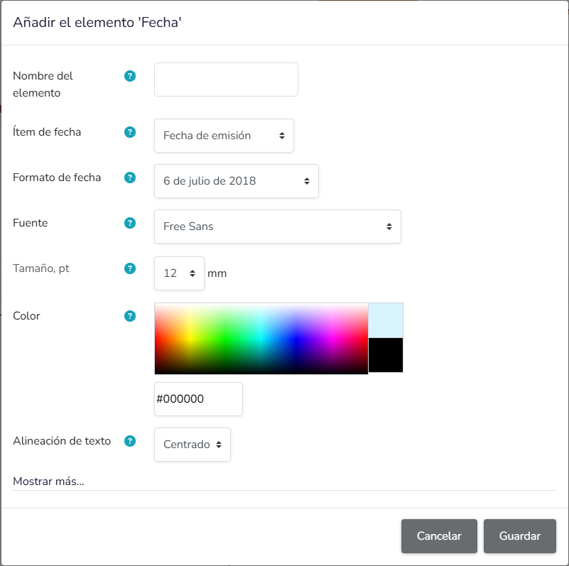
- Element name: Free text field to assign an identifying name to the Date element. This name is used to distinguish the element within the template.
- Date item: Dropdown to select the type of date to display. The value shown is Issue date.
- Date format: Dropdown to select the display format. The format shown is 6 July 2018.
- Font: Dropdown to select the font associated with the element. The value shown is Free Sans.
- Size, pt: Numeric field. Default value: 12, unit: mm.
- Color: Color selector for the Date element.
- A graphical color picker.
- A field to enter the value in hexadecimal format.
- Text alignment: Dropdown to set the alignment of the element content.
- Show more…: Clicking this button opens a panel to position the element within the design.
5. Digital signature
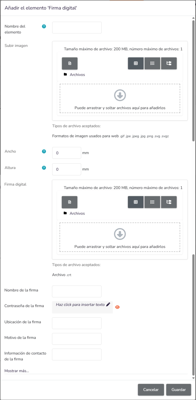
- Element name: Allows assigning an identifying name to the Digital signature element.
- Upload image: File upload block to add an image.
- Accepted file types: Web image formats (.gif, .jpe, .jpeg, .jpg, .png, .svg, .svgz).
- Width: Defines the width of the element.
- Height: Defines the height of the element.
- Digital signature: Specific file upload block for the digital signature.
- Accepted file types: .crt file.
- Signature name: Allows entering the name of the signature.
- Signature password: Text field to enter a password associated with the signature.
- Signature location: Text field to indicate the location associated with the digital signing process.
- Common use: Records a location reference linked to the signature, such as a city, headquarters, department, office, or administrative location.
- Purpose: Provides descriptive context to the signature and may appear as part of the visible data or metadata of the signed document.
- Examples: Madrid, Head Office, Quality Department, Barcelona Branch.
- Signature reason: Free text field to indicate the reason for the digital signature.
- Common use: Describes the purpose of the signature, e.g. approval, validation, conformity, or acceptance of the document.
- Purpose: Adds a functional or administrative explanation associated with the applied signature.
- Examples: Document approval, Final validation, Conformity, Acceptance of conditions.
- Signature contact information: Free text field to enter the contact details associated with the digital signature.
- Common use: Records a contact method for the signer or related entity, such as email, phone, extension, or responsible area.
- Purpose: Facilitates identification and contact associated with the signing process.
- Examples: name@company.com, +34 600 000 000, Legal Department – legal@company.com.
- Show more…: Clicking this button opens a panel to position the element within the design.
6. Image
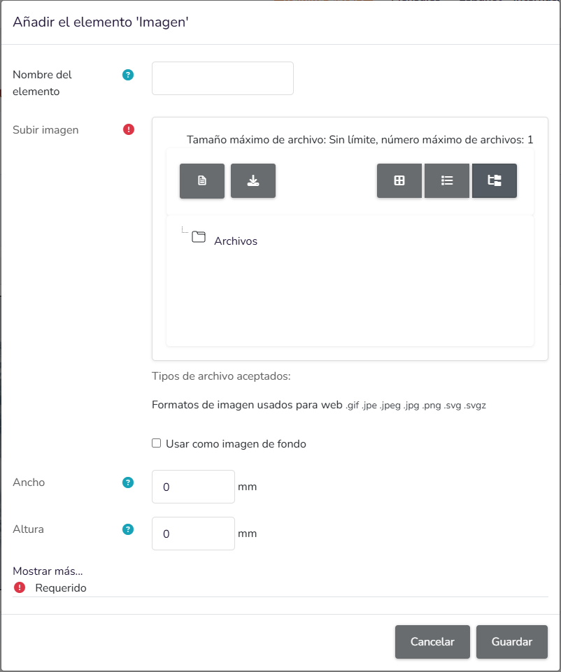
- Element name: Allows assigning an identifying name to the Image element.
- Upload image: File upload block to add an image.
- Accepted file types: Web image formats (.gif, .jpe, .jpeg, .jpg, .png, .svg, .svgz).
- Use as background image: Checkbox to set the uploaded image as the background.
- Width: Defines the width of the element.
- Height: Defines the height of the element.
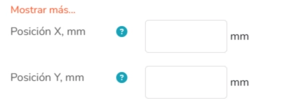
- Show more…: Clicking this button opens a panel to position the element within the design.
7. Dynamic fields
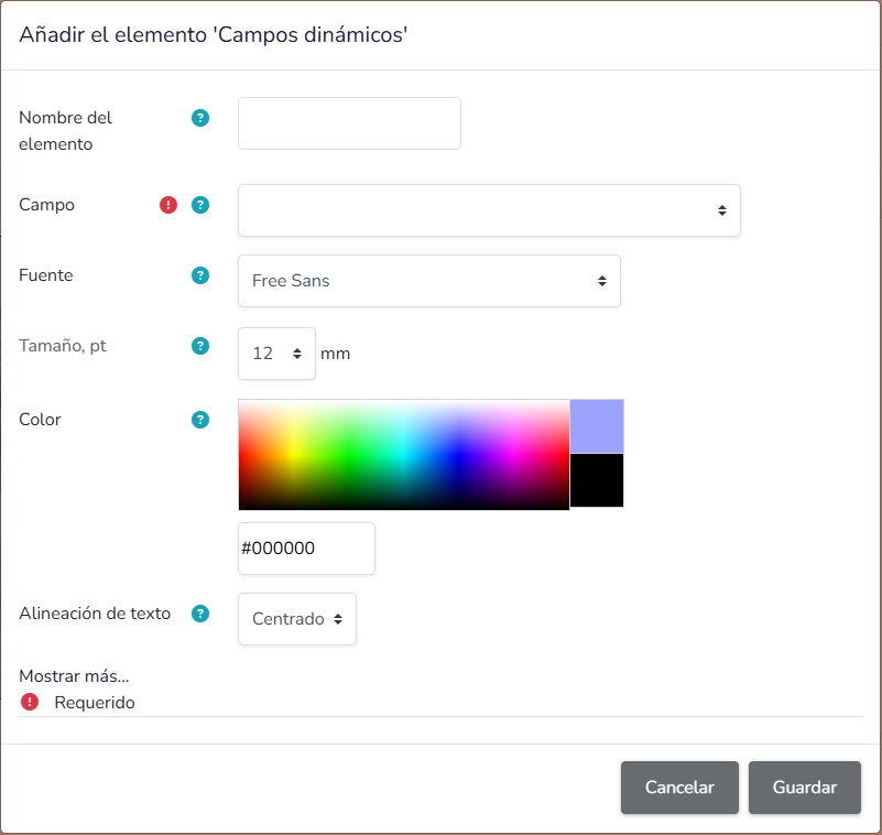
- Element name: Allows assigning an identifying name to the Dynamic fields element.
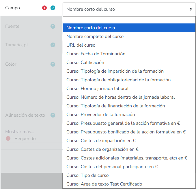
- Field: Dropdown to select the dynamic field to insert into the element.
- A dynamic field is an element that does not display a fixed value entered manually at design time, but a value retrieved from a data source or the context in which the document is generated.
- Its purpose is to automatically incorporate variable information, avoiding the need to manually enter the same data each time.
- This type of field is commonly used to display information that may change depending on the record, user, document, or applied configuration.
- The final displayed value depends on the field selected in this dropdown.
- Font: Dropdown to select the typeface for the dynamic field content.
- Size, pt: Numeric field to define the text size of the dynamic field.
- Color: Color selector for the dynamic field text.
- Includes a visual color palette.
- Also allows entering or viewing the color via a color code.
- Text alignment: Dropdown to define the alignment of the content displayed in the dynamic field.
- Show more…: Clicking this button opens a panel to position the element within the design.
8. Text
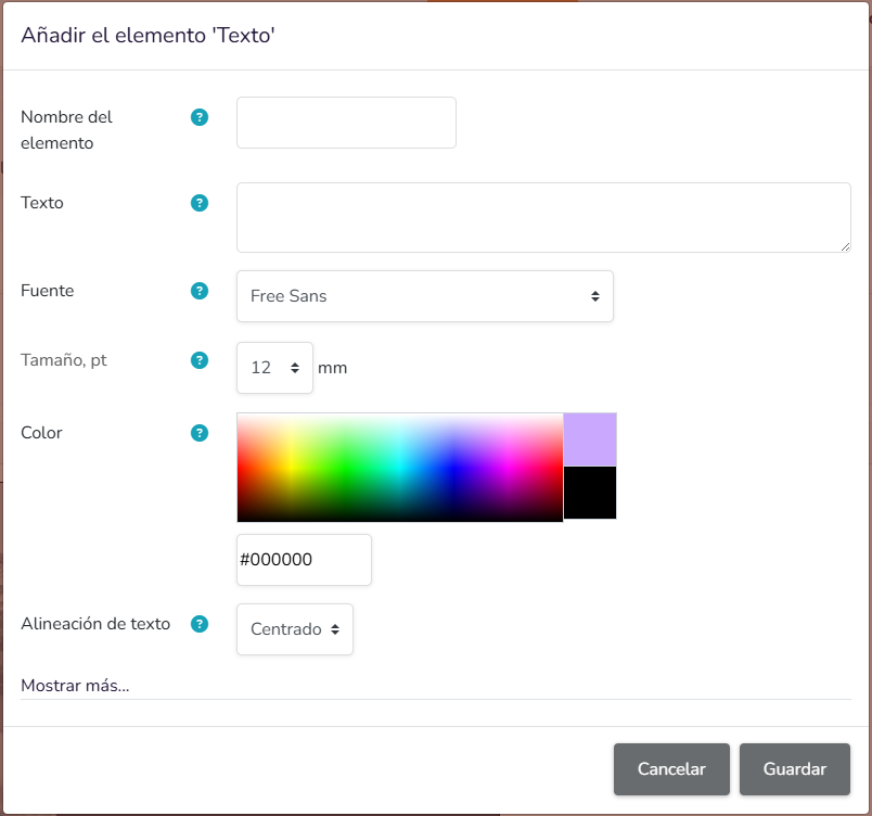
- Element name: Allows assigning an identifying name to the Text element.
- Text: Multiline text field to enter the textual content to be displayed in the element.
- Font: Dropdown to select the typeface for the element text.
- Size, pt: Numeric field to define the text size of the element.
- Color: Color selector for the text.
- Includes a visual palette for color selection.
- Also allows entering or viewing the color via hexadecimal code.
- Text alignment: Dropdown to define the alignment of the text content within the element.
- Show more…: Clicking this button opens a panel to position the element within the design.
9. User field
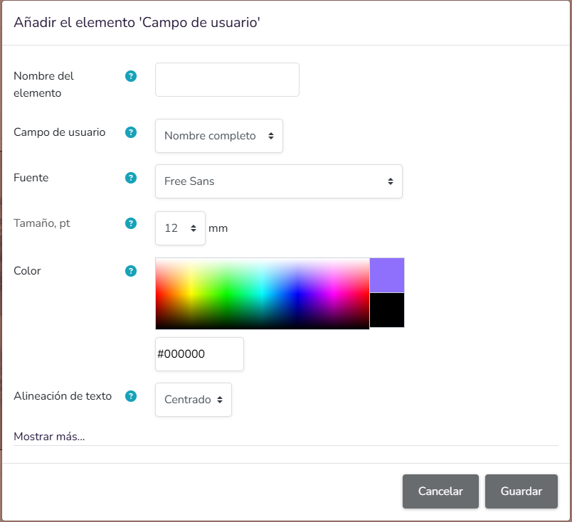
- Element name: Allows assigning an identifying name to the User field element.
- User field: Dropdown to select which user data will be automatically displayed in the element.
- A user field is data associated with the user's profile within the platform, automatically inserted into the document or template without needing to enter it manually.
- Its purpose is to retrieve existing user information and display it where this element is added.
- This type of field personalises the content based on the person the document is associated with, so the displayed value may vary from one user to another.
- Font: Dropdown to select the typeface for the user field content.
- Size, pt: Numeric field to define the text size of the user field.
- Color: Color selector for the user field text.
- Includes a visual palette for color selection.
- Also allows entering or viewing the color via hexadecimal code.
- Text alignment: Dropdown to define the alignment of the content displayed in the user field.
- Show more…: Clicking this button opens a panel to position the element within the design.
10. User image
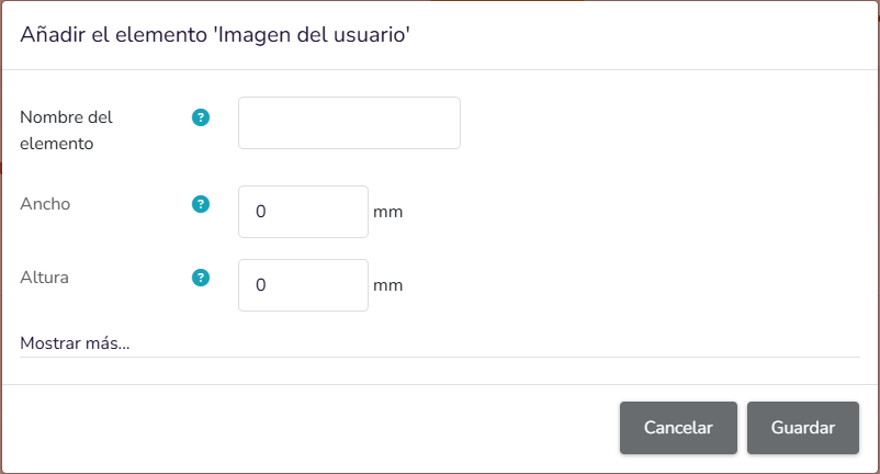
- Element name: Allows assigning an identifying name to the User image element.
- User image: Element that automatically displays an image associated with the user within the document or template.
- A user image is typically the profile picture or avatar the user has associated with their account on the platform.
- Its purpose is to automatically incorporate a visual representation of the user, without needing to manually upload a different image for each case.
- This type of element is used when you want to personalise the document with visual information about the user it is linked to.
- Width: Defines the width at which the user image will be displayed.
- Height: Defines the height at which the user image will be displayed.
- Show more…: Clicking this button opens a panel to position the element within the design.